
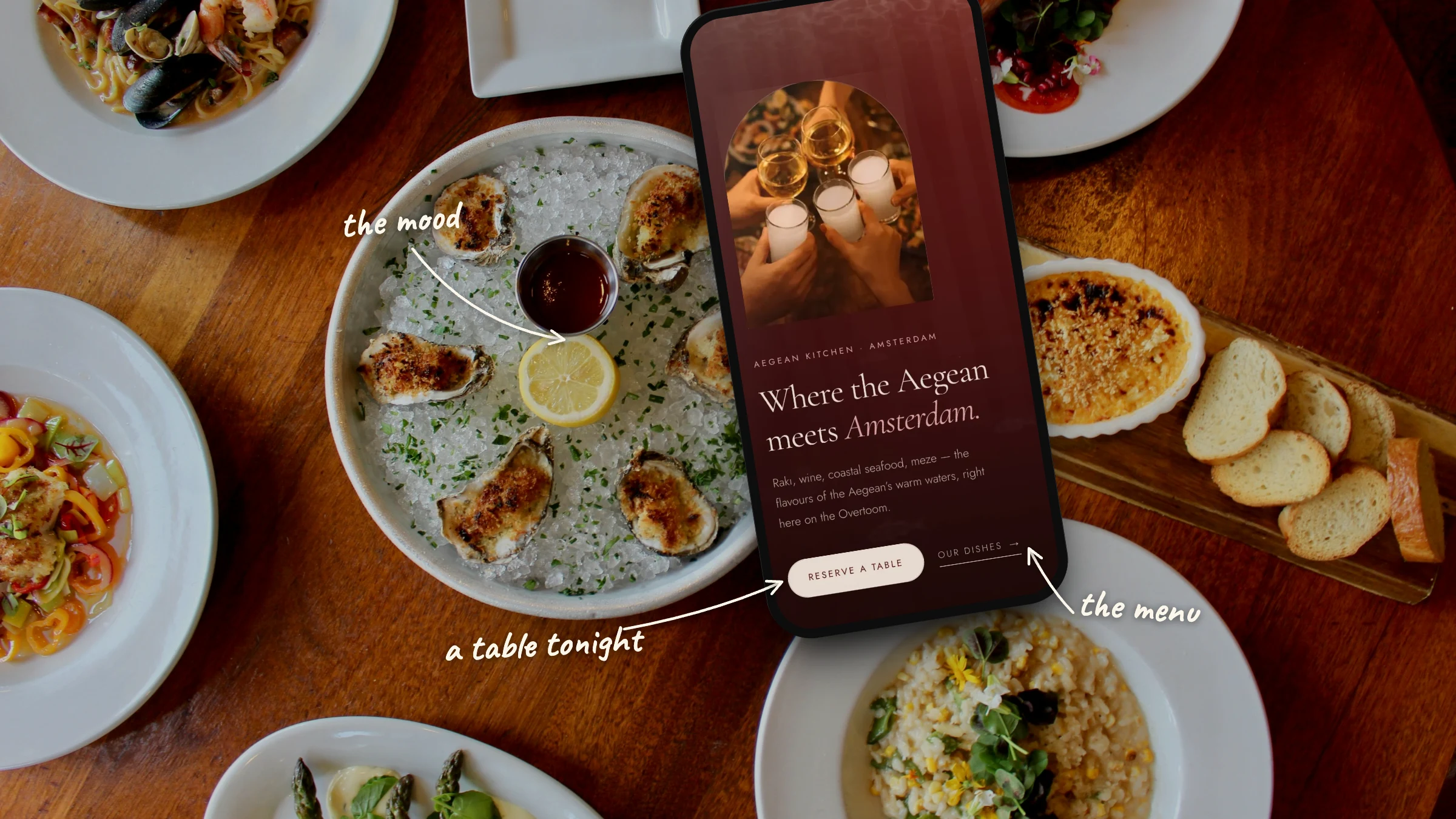
Most people find a restaurant on a phone, often an hour before they want to eat, and they want three answers quickly. What is on the menu, where is it, and can they get a table tonight? A restaurant website that hides those answers behind a slideshow loses guests to the place down the street whose site does not, which makes good restaurant website design less about impressing other designers and more about getting a hungry person from curiosity to a booked table. This guide covers what the site needs, how to build it and how guests find it.
What a restaurant website needs: the essentials
A restaurant website needs to answer what guests come to check, quickly and on a phone. That means the menu, the address and opening hours, and a way to book or order. Around those essentials sit the things that make someone choose you, such as photographs of the food and the room, a short story about the kitchen, and a sense of the evening they can expect.
Everything else is optional. A long history of the building, a gallery of every event or a newsletter sign-up can all earn a place, but only once the essentials are effortless. The table below lists what guests look for and the mistakes that most often get in the way.
| Element | What the guest wants | Common mistake |
|---|---|---|
| Menu | To see the dishes and prices before deciding | A scanned image, or a card from last season |
| Hours and address | To know whether you are open tonight and how to get there | Hours that differ from those on Google |
| Booking or ordering | To reserve or order in a few taps | A booking link hidden in the footer |
| Photography | To see the food, the room and the light | Stock photos, or dark images that load slowly |
| Contact | To call or write with a question | A contact form as the only option |
| Story | To understand what kind of place it is | A long history placed before the menu |
The site we designed for Arlin, an Aegean restaurant on the Overtoom in Amsterdam, is built around exactly these essentials. A first screen sets the mood, then come the kitchen, a selection of dishes, the menu and the address with directions, with a reservation button that returns throughout the page. More of our work across sectors is in our cases.
How to make a restaurant website, step by step
To make a restaurant website, decide first what guests need to do on it, then gather the menu, photographs, hours and story, choose how bookings and orders will work, and design for a phone before a desktop. Finally, connect the site to Google and test every path. The build itself goes faster once those decisions are made.
- 1 Decide what the site must do. Showing the menu and the address, taking bookings, takeaway orders, private events or gift vouchers each add a different page or integration. Settle the list before anything is designed, because it shapes the structure.
- 2 Gather the content first. Collect the current menu with dishes and prices, allergen information, opening hours including holidays, the address and directions, and a short paragraph about the kitchen. Real content shapes the design. Placeholder text hides problems until the week of launch.
- 3 Photograph the food and the room. Good photographs do more for a restaurant site than any layout choice. Plan a shoot in the light guests actually see, with close-ups of dishes and wider shots of the room and the team.
- 4 Choose your booking and ordering tools. Most restaurants already use a reservation system or a till with ordering built in. The site should connect to those rather than replace them, so check how each one embeds or links and whether it works well on a phone.
- 5 Design for the phone first. Lay the page out for a narrow screen and a thumb, then let it grow for larger screens. Google also uses the mobile version of a site for indexing, as its guidance on mobile-first indexing explains.
- 6 Connect it to Google and test it. Complete the Business Profile, add structured data, and open the site on real phones over a mobile connection. Then make a test booking, a test order and a test enquiry before launch.
The menu: on the page, as a download, or both
Put the menu on the page as real text, so guests can read it on a phone, search engines can index the dishes, and screen readers can read it aloud. A downloadable PDF is a useful extra for the full card or for one that changes every week, but it should not be the only way to see what you serve.
Google does index PDF files (they are on its list of indexable file types), so a PDF menu is not invisible to search. The trouble lies elsewhere. On a phone a PDF opens in a separate viewer, the text is small, and guests pinch and scroll to read a single dish. Many PDF menus are exported from a design tool without the structure screen readers need, and a scanned or photographed menu is only an image.
There is an honest case for a download, though. Arlin's menu changes often, so the full card lives as a download, while the page itself presents the kitchen and a row of signature dishes as text, each with a short description. That keeps the page current without anyone editing the website every weekend. For most restaurants the same pattern works well, with the dishes that define the place on the page and the full, changing card as a download beside them.
A good online menu includes:
- Dishes and prices as text, grouped the way the printed card groups them.
- Allergen and dietary marks (vegetarian, vegan, gluten-free), with a line on how to ask the team about allergies.
- The season or date the menu applies to, so guests can trust it is current.
- A link to the full card as a download when it changes often, with its size shown so guests on mobile data know what they are opening.
Reservations and online ordering
Make booking or ordering the obvious next step on every screen, and use the system the restaurant already runs rather than adding a separate one. A guest should be able to reserve a table or place an order in a few taps, without being sent to an unfamiliar site or asked to fill in a long form.
There are three common ways to take reservations. The first is a widget from the reservation system embedded in the page. The second is a button that opens the system's own booking page. The third, for smaller places, is a clear phone number and email address. Whichever the restaurant uses, the button needs to be easy to reach. On Arlin's site the reservation button returns in every part of the page on a phone, because that is where most guests decide where to eat tonight. Larger parties are asked to write to the restaurant directly, which keeps the online flow simple.
Online ordering follows the same logic. Ordering through the restaurant's own site keeps the relationship with the guest, while delivery platforms bring reach, and many restaurants use both. What matters on the website is that the ordering link leads straight to the menu the guest was just reading, and that it works as well on a phone as the rest of the site.
The same links can reach guests who never open the website. A Google Business Profile can carry a menu link and links for booking and food orders, as Google's help on local business links explains, so a guest who finds the restaurant on Maps can book from there.
How to design a restaurant website that sets the mood
Design a restaurant website so it feels like the place itself, with the same colours, light, materials and pace as the room. The mood decides whether someone wants to go, and the layout decides whether they can quickly find out how. A good design does both without one getting in the way of the other.
Photography carries most of the mood, so it gets the most room. Typography and colour come next. For Arlin we used deep wine red, warm candlelight photography and a serif that takes its time, so the design borrows its pace from the Aegean coast, where no one hurries a meal. The dishes appear one plate after another, in a showcase that scrolls sideways, much as small plates keep arriving at the table.
A few choices keep the mood from costing usability:
- Keep text on top of photos readable. Darken the image behind it or place the text beside the photo, so the contrast holds on every picture.
- Use motion sparingly. A gentle reveal adds atmosphere, but a page that will not settle is tiring on a phone. Respect the system setting for reduced motion.
- Be careful with video. A background video can set the scene beautifully, but it is heavy. Use a short, compressed loop with a still image shown first, or a strong photograph instead.
The words carry the mood as much as the pictures do. A short, specific description of the kitchen says more than a paragraph of adjectives, which is the idea behind a tone of voice made of decisions. In a city like Amsterdam, where many guests are visitors, consider offering the site in two languages. Google's guidance on localised versions of a page explains how to tell it which version is which.
Restaurant website SEO: being found in Google and on Maps
Most restaurant searches are local, such as a cuisine plus a neighbourhood or simply "near me", so being found depends on Google understanding where you are, what you serve and when you are open. A complete Business Profile, a website that states the same facts in text, and Restaurant structured data do most of the work.
Start with the Business Profile. It is often the first thing a guest sees, before the website itself. Google's guide to setting up a Business Profile for a restaurant covers the basics. Keep opening hours current (including holiday hours), add good photographs, and link the menu and the booking page.
Keep the facts identical everywhere. The name, address, phone number and opening hours should match on the website, the Business Profile and any listing or booking platform. Differences confuse guests first and search engines second.
Write the cuisine and the area into the page. A heading or sentence that says what you cook and where you are (an Aegean kitchen on the Overtoom, for example) gives Google plain text to match against searches. Dish names as text help in the same way.
Add structured data. Google's documentation on local business structured data asks for the name and address, recommends the cuisine, the menu address, opening hours, telephone and price range, and advises using the most specific type, such as Restaurant. Arlin's site carries this Restaurant markup with its cuisine.
If the restaurant is replacing an older site, keep the old addresses working with permanent redirects so existing rankings carry over. Our guide to a website redesign without losing search traffic sets out the method.
Speed and accessibility on a restaurant website
A restaurant site is often opened on a phone over a weak connection, outside or on the way somewhere, so it has to load fast and stay readable. Google's Core Web Vitals set clear targets for speed, and the WCAG guidelines describe what makes a site usable for guests with a visual, hearing or motor impairment.
Large photographs and background video are the usual cause of a slow restaurant site. The answer is not fewer pictures but lighter ones, with images sized for the screen they appear on, modern formats and nothing loaded before it is needed. On Arlin's site the first load is 0.3 MB in 32 requests, where the old site loaded 1.4 MB in 209 requests before a guest had scrolled. It also carries no analytics and no advertising pixels, so the page loads the restaurant and nothing else. The Core Web Vitals on web.dev set the targets. The main content should appear within 2.5 seconds, the page should respond to a tap within 200 milliseconds, and the layout should not jump while it loads.
Accessibility asks for a few habits that also help every guest. The WCAG 2.2 guidelines from the W3C cover them in detail.
- Menus, hours and prices as real text, never only inside an image.
- Enough contrast between text and background, including text over photographs.
- Buttons large enough to tap and reachable with a keyboard.
- Short descriptions on photographs of dishes, so a screen reader can tell a guest what is on the plate.
If the site sells online, for instance through orders or gift vouchers, check whether the European Accessibility Act applies, as the EU's Your Europe guidance explains. Very small service businesses (fewer than 10 employees, with a small turnover) are exempt.
What drives the cost of a restaurant website
The cost of a restaurant website depends on what it has to do rather than on how it looks. The number of pages and languages, the booking and ordering integrations, the photography, and how the menu will be kept current decide most of it. A one-page site with a linked booking tool and a multi-page site with ordering and vouchers are different projects.
| Cost driver | Smaller scope | Larger scope |
|---|---|---|
| Pages and languages | One page in one language | Several pages in two or more languages |
| Bookings and orders | A link to the existing system | Embedded booking, ordering and vouchers |
| Photography | Existing photographs | A new shoot of the dishes and the room |
| Menu updates | A download replaced when the card changes | An editable menu the team updates itself |
| Brand | The current logo and colours | A refreshed identity alongside the site |
Arlin sits between the two columns. It is a single page, but it came with a refreshed identity (the wordmark redrawn and animated, a new palette and typography) and a designed menu section. A quote worth trusting names each of these drivers, so you can see what changes the price and decide what the restaurant really needs now.
Website builder or a designed restaurant website?
A template builder can be enough for a restaurant that needs a menu, hours and a booking link, and has someone to keep it current. A designed site makes sense when the atmosphere is part of what you sell, when booking, ordering and the menu need to work well together, or when speed and search matter more than a quick start.
Builders are quick to start with and easy to update, and their templates usually work on a phone. The limits show later, in pages that load slowly because the template carries more than the restaurant needs, in a look shared with many other restaurants, and in integrations that only work the way the builder allows.
A designed site starts from the restaurant rather than from a template. For Arlin we chose a hand-built single page, because the content beyond the menu download changes rarely and speed mattered. A restaurant that changes its menu and events every week is often better served by WordPress, where the team can edit a dish without a developer. The right choice depends on who will keep the site current, more than on what looks best on launch day.
Frequently asked questions
It depends on scope rather than on looks. The main cost drivers are the number of pages and languages, booking and ordering integrations, new photography, and whether the team needs to edit the menu itself. A single page linked to an existing booking system is a much smaller project than a multi-page site with ordering and gift vouchers.
There is no single best one. A template builder suits a restaurant that needs a menu, opening hours and a booking link and has someone to keep it current. When atmosphere, speed, search or several integrations matter, a designed site usually serves the restaurant better than a template.
Not only a PDF. Put the menu, or at least the dishes that define the restaurant, on the page as text so guests can read it on a phone and search engines can index it. A PDF works well alongside it for the full card, especially when the menu changes often.
Only if the restaurant offers takeaway or delivery and has a system to handle the orders. If it does, the ordering link should sit next to the menu and work well on a phone. Many restaurants combine ordering on their own site with delivery platforms.
Create and verify a Google Business Profile, then complete it with the correct address, opening hours, photographs, a menu link and a booking link. Keep those details identical on your website, and add Restaurant structured data so Google can connect the site to the place.
It is worth it when a large share of guests are visitors, as in Amsterdam. Offer each language as its own version of the page rather than an automatic translation, and tell Google which version is which, so a guest from abroad lands on the right one.
The homepage should show at once what kind of place it is, through a strong photograph and one line about the kitchen. Below that come the menu or a selection of dishes, the address and opening hours, and a booking or ordering button that stays within reach on a phone.